Nothing Phone 4a: Fixing Past Mistakes with a Promising Design
Last year, I wrapped up my review of the Nothing Phone 3 with mixed feelings. While I appreciated Nothing OS and the camera setup, I couldn't fully embrace the revamped design, especially the Glyph Matrix. It felt like a good concept that never quite took off. Since then, Nothing has tried to make it more useful, but some design flaws are just too deep to fix.
That's why I'm genuinely excited about the first glimpse of the new Nothing Phone 4a. In my opinion, it represents both a step forward and a nod to a better design era, addressing the shortcomings of its predecessor. I think Nothing is on the right track, offering a device that is both functional and aesthetically pleasing.
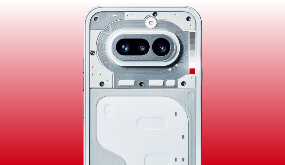
If you've seen or held the Nothing Phone 3, you probably understand where I'm coming from. At first glance, its design is unique and distinct. It's definitely not a Pixel or an iPhone. The cameras are separated, and the Glyph Matrix has a completely new placement. However, this design made it incredibly difficult to find decent cases when the phone was first launched.
While the situation has improved with options from brands like Ringke and Spigen, there's still no official first-party case. It's as if Nothing would rather you buy their clothing line instead. The Phone 3's complicated design probably makes repairs tricky as well.
With the unveiling of the Nothing Phone 4a, I feel a sense of relief. I can't believe I'm saying this, but I'm excited to see a pill-shaped camera bump again! It reminds me of recent Pixel phones or the Galaxy S10. I know there will be tons of case options for those phones. I'm not expecting the same level of support for Nothing's latest budget offering, but the simpler design should translate to more case variety. I remember that the cases were a big issue on launch, so I hope they solved this!
Of course, Nothing's continued changes to its light-up design add a layer of complexity. However, I believe the Glyph Bar will be an improvement. Its closer to the original Glyph Interface, which is a series of lights, rather than a display. Case designers shouldn't need to worry about cutting holes for a Glyph button.
While I don't love that the redesigned Glyph Bar means case designers need to start over, the solution this time seems much simpler. A transparent section or cutout could showcase the light-up interface without compromising protection. If they could do it for Apple's Camera Control, they can certainly do it here. This is, for example, something that gives me hope.
My main issue with the Glyph Matrix is that I barely use it. Nothing intended it as a quick interface to check instead of opening your phone, but I find that it rarely provides enough context. It's good for checking charging status or Uber arrival times, but that's about it. I mean, I have a lot of fun using it for that.
If that was all Nothing intended for the Glyph Matrix, I'd be fine with it. The older Glyph Interface did roughly the same thing, showing task progress along its LED bars, but in a less obtrusive way. When you have a circle of hundreds of lights, and you're only using a strip in the middle, it's hard not to be disappointed. I've never wanted to play spin the bottle on my phone, but the Nothing Phone 3 makes it a reality, I guess.
While I don't yet know how the Glyph Bar will work, I expect it to be an improvement. It'll simplify notifications and other apps, which I loved in the first place. Maybe it'll bring back the Glyph Composer, use the red LED as a recording indicator, or just light up to the beat of my ringtone. I'll take all of it if it means I use my phone less.
However, all of this makes me nervous. I'm not sure I can trust Nothing to stick with its next iteration of Glyph lights. They're just going to keep refreshing things, adding Glyph Toys while stripping back the Glyph Composer. I worry that the Nothing community will get tired of constant change when they can only flex their creativity for certain users. For now, though, I'll stay optimistic and hope for the best out of yet another design refresh.
Source: AndroidAuthority