Google's Gemini Overlay Gets a Bouncy New Animation
Google's Gemini is Getting a Bouncier Makeover!
I've been keeping a close eye on Google's Material 3 Expressive design language, and it's clear that some pretty significant changes are on the horizon for Android. This isn't just about a fresh coat of paint; it's a fundamental shift in how we interact with our devices.
We're talking about things like rounded edges and high-contrast elements, but the real magic happens when you see it all in motion. Imagine a UI that feels alive, with elements that bounce and react to your touch. That's the direction Google's heading.
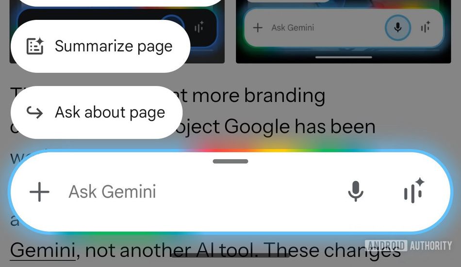
Remember when I showed you that sneak peek of the Gemini overlay sliding up from the bottom of the screen with a bit of extra oomph? Well, Google's not stopping there. They're continuing to refine this "bouncy" behavior, and the latest beta version of the Google Android app (version 16.28.59.sa.arm64, for those keeping track) reveals even more tweaks.
Instead of just the main input bar smoothly gliding into place, the chips for additional options will now swing into view with a bit more flair. It's a subtle change, but I think it could make a big difference in terms of encouraging user interaction. I mean, who doesn't love a little visual flourish?
Of course, it's important to remember that Google is still experimenting and feeling things out. Nothing is set in stone yet. However, the direction they're heading seems pretty clear. The changes we’re seeing are not random; they suggest a deliberate effort to make Gemini more engaging and user-friendly.
I think these kinds of subtle design choices will be crucial in getting users comfortable with Gemini and all its capabilities. It's not just about making things look pretty; it's about creating an experience that feels intuitive and enjoyable. So, what do you think? Are you excited about the prospect of a bouncier, more expressive Android UI? I know I am!
Source: AndroidAuthority