Android's New Bouncy Design: Is it a Hit or a Miss?
Google's giving Android a major makeover, and it's all about motion and feeling. After spending some time with the latest Android beta, I can say the changes are quite noticeable. Forget the rigid, static interfaces of the past – Google's aiming for something more fluid, almost bouncy.
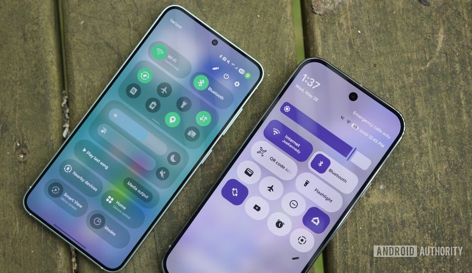
One of the first things you'll notice is the new notification panel. Dismissing alerts now feels like peeling them away from a stack, and I think it's really cool. The corners of the notification morph, and the surrounding notifications react to your swipe. When the notification detaches, you feel a satisfying haptic feedback. It's a small change, but it makes a big difference.
However, that's not the only novelty. I've also noticed an increase in shape-shifting elements. Buttons morph into different shapes to indicate their state. For example, in the Quick Settings panel, the flashlight button transforms from a rounded oval to a rounded square when you turn it on. And of course, there's that signature "bounce" that ties everything together.
A New Motion Physics System
Google's even introducing a new motion physics system, giving developers more control over app animations. I think this is really neat. I'm eager to see how developers use this to create apps that feel truly alive and responsive. Imagine buttons that spring back with a satisfying *thunk* or transitions that flow seamlessly from one screen to another.
However, the big question is: will developers embrace this new design language? Will they take the time to implement these new animations and transitions in their apps? It will take time to see if the third party developers follow suite and adhere to the new design.
I will say that Google is betting big on this new design direction, which they are calling Material 3 Expressive. Personally, I think it's a smart move. Android has been around for a while, and it's time for a fresh look. By embracing motion and fluidity, Google can appeal to a wider audience, including users who are used to the smooth interfaces of other mobile operating systems.
I've been an Android user for quite a while. Although I can't speak for the older Android veterans, I believe that this is a move in the right direction. I think the fluidity adds a new dimension to the user experience that was simply missing before. All of these little changes add up to a more cohesive and intentional design. In the end, I really think that Google is on the right track with Material 3 Expressive.
Source: AndroidAuthority