Android Auto's New Look: Is It a Hit or a Miss for Music Fans?
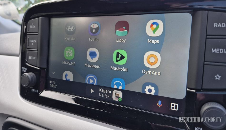
So, Google recently gave Android Auto's interface a fresh coat of paint with Material You, aiming to sync your car's display with your phone's wallpaper. While I appreciate the effort to keep things modern, it seems like not everyone's thrilled with the update, and honestly, I get it.
The big gripe? Music player interfaces now pull colors from your wallpaper instead of the album art itself. It's a shift that, while aiming for consistency, might leave music lovers feeling a bit disconnected. The update also tweaks the music player's layout. The seekbar is closer to the album art, which sounds good in theory, but it creates awkward empty spaces in the UI.
I think shrinking the album art, especially when there's so much room to spare, is a strange choice. If you have a portrait screen in your car, the album art will become comically tiny. It's these little details that can make or break a user experience, and in this case, it feels like a step backward.
What do you think? Did you like the change? Let me know your thoughts in the comments.
Source: AndroidAuthority