Android 16 Revamps Icon Customization: A Fresh Look for Pixel Users
Google's latest Android 16 update is a breath of fresh air for Pixel users like myself. After what felt like an eternity, they've brought back some much-missed icon customization features. I know I'm not alone in appreciating these small but significant tweaks that really let you personalize your phone.
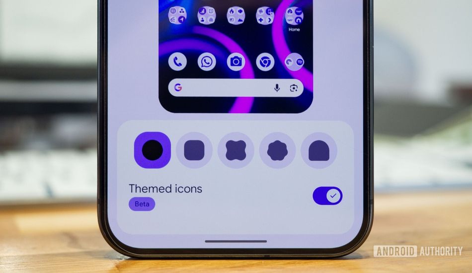
For those who've been out of the loop, the update reintroduces icon shape customization, which vanished with Android 12's Material You design. If you remember, prior to that, we could freely choose our icon shapes. Alongside this welcome return, Google has also implemented forced icon theming, ensuring that every icon conforms to your chosen Material color and shape, regardless of whether the app developer implemented it or not.
Getting Started: Is Your Phone Ready?
Before you dive in, you'll need a compatible Pixel phone running the latest update. If you own a Pixel 6 or later, you're in luck. To confirm you're on the right track, head to your phone's settings and check the build number. It should start with "BP4A.251205.006". If it doesn't, a quick system update should do the trick. I had to do this myself, and it was a pretty painless process.
Unleashing the Customization Power
Once you're updated, customizing your icons is a breeze. Simply tap and hold on an empty spot on your home screen, then select "Wallpaper & style," and then "Icons." You'll find options to switch between various icon shapes, including circles, squares, and a few more quirky options. The "Themed icons" toggle is also there, still marked as "Beta," but now it genuinely themes every icon on your home screen, even those that previously resisted.
I remember being so frustrated with the inconsistent look of themed icons in the past. Some apps would adapt, while others would stick to their original designs, creating a jarring visual experience. However, with this new update, Google has finally cracked the code. I'm seeing a unified aesthetic across my home screen that's far more pleasing to the eye.
For example, apps like Amazon, Jotterpad, and even some of Google's own apps now seamlessly blend into the overall theme. This creates a sense of harmony that I didn't realize I was missing. Even the small shortcut icons get themed, which is a nice touch that wasn't possible before.
While I do sometimes miss the vibrant colors of the default icons, the consistency of the themed icons is growing on me. It feels more polished and intentional, and I'm excited to see if I can fully embrace it in the long run. If you, like me, had given up on themed icons, I encourage you to give them another shot.
Source: AndroidAuthority